I think this one turned into graphic design project rather than illustration. I guess partly because of the idea and the art movement that I chose.

But first thing's first...
I came up with two ideas. One was based on Surrealism and the amazing park of Las Posas in Mexico that I visited just couple months before. And the other one, surprisingly enough, was inspired by something quite annoying – Caltrain that runs right under my window, and that one I thought I'd relate to Futurism.
These are my initial sketches.

When I showed these to our teacher, she got very excited about Caltrain for some reason. She said, I know you can make this one pretty (meaning Las Posas), but this one is a really cool idea. You can make it into a logo and sell it to them, she said. I was skeptical about selling anything to anyone, but at least I was happy that she liked my idea. And so began the Caltrain ordeal.
It turned out to be quite a challenge. I was stuck for a while, making sketches of pretty much the same thing with little variations, and basically going in circles.

Nothing looked right. Also in the process I realized that Constructivism would suit this idea much better, and frankly, I am not a big fan of this movement. Plus, I don't exactly love Caltrain either. So at some point I caught myself thinking, why am I working on a project that pretty much consists of things I dislike. Voluntarily. I wasn't really sure.
But I didn't want to give up, so I went to a friend of mine who is a professional artist (Maria Zhalnina) for an advise. And she finally kicked me out of that vicious circle. I realized that all my sketches were too feminine, that I kept trying to make it look like a dress and that I could turn my antipathy towards this awful train to my advantage by ridiculing it in the design.
Phase 2 sketches looked like this.

By the end of page two I had something I was happy with. Next question was – which media to use. One of the project requirements was to use watercolor. But watercolor didn't seem to suit the constructivist poster that I had in mind at all. So I decided to do a watercolor collage.
To make things easier for myself I finished designing the poster in photoshop, finalized the colors and printed it out life size so I could use it as a template and a cutting stencil.

Then I started painting and cutting out the pieces of the train. That required a lot of space, so kitchen table had to be sacrificed. Temporarily.

Plan A was to put everything together as one big puzzle. But for some reason background pieces didn't want to match up with the train, so I quickly came up with plan B – keep the two separate. Which actually made my life a lot easier.
Here is the first attempt to match up all the pieces.

Then I painted the background "rainbow", piece by piece. (When working with watercolor and running out of time, hair drier becomes your best friend.)

Then, finally the train and the background were somewhat finished...

... only letters remained.


After all the letters were glued and I put the train on top of the background, I felt something was missing. Somehow it didn't feel right. It looked too busy all together. So I decided to add a little dimension to this poster and raised the train on a little paper box. This way it was separated from the background just enough to make things more interesting. No one can probably see it here, on a flat photo, but believe me it's 3 dimensional. :)
Aaaand here is the final product.

While researching Constructivism, I noticed that a lot of posters while using simple graphic shapes and lines had some grungy texture to them which I liked a lot. So I wanted texture on my poster as well. First, I got lucky and found this really cool, denim-looking blue paper at Scrap (A great resource for artists, especially when you want to save some money). And then in class I learned a few ways to add different textures to watercolor, and one of them was to use table salt and baking powder. It took some trial an error to get the look that I wanted since the results are pretty unpredictable with this technique, but finally it worked out.
So in the end, I am happy with the design. My cutting skills leave much to be desired, unfortunately, and maybe if i had to do this again and for a client, I would cut out and put everything together in Photoshop. But I took this class to do things by hand, and so there it is, another somewhat imperfect handmade poster.

But first thing's first...
I came up with two ideas. One was based on Surrealism and the amazing park of Las Posas in Mexico that I visited just couple months before. And the other one, surprisingly enough, was inspired by something quite annoying – Caltrain that runs right under my window, and that one I thought I'd relate to Futurism.
These are my initial sketches.

When I showed these to our teacher, she got very excited about Caltrain for some reason. She said, I know you can make this one pretty (meaning Las Posas), but this one is a really cool idea. You can make it into a logo and sell it to them, she said. I was skeptical about selling anything to anyone, but at least I was happy that she liked my idea. And so began the Caltrain ordeal.
It turned out to be quite a challenge. I was stuck for a while, making sketches of pretty much the same thing with little variations, and basically going in circles.

But I didn't want to give up, so I went to a friend of mine who is a professional artist (Maria Zhalnina) for an advise. And she finally kicked me out of that vicious circle. I realized that all my sketches were too feminine, that I kept trying to make it look like a dress and that I could turn my antipathy towards this awful train to my advantage by ridiculing it in the design.
Phase 2 sketches looked like this.

By the end of page two I had something I was happy with. Next question was – which media to use. One of the project requirements was to use watercolor. But watercolor didn't seem to suit the constructivist poster that I had in mind at all. So I decided to do a watercolor collage.
To make things easier for myself I finished designing the poster in photoshop, finalized the colors and printed it out life size so I could use it as a template and a cutting stencil.

Then I started painting and cutting out the pieces of the train. That required a lot of space, so kitchen table had to be sacrificed. Temporarily.

Plan A was to put everything together as one big puzzle. But for some reason background pieces didn't want to match up with the train, so I quickly came up with plan B – keep the two separate. Which actually made my life a lot easier.
Here is the first attempt to match up all the pieces.

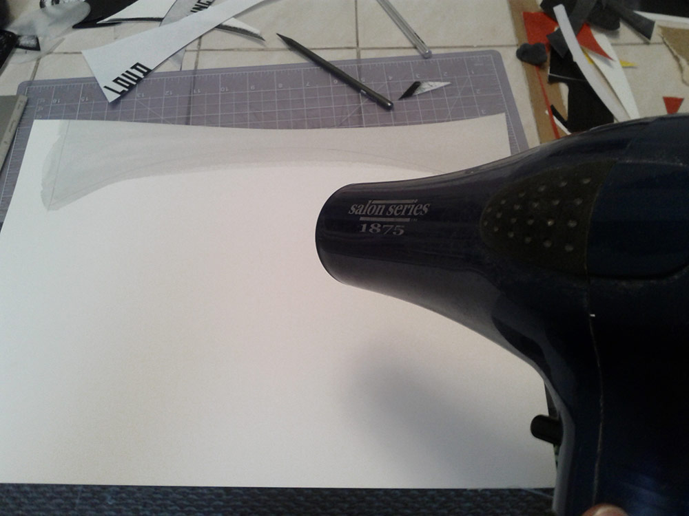
Then I painted the background "rainbow", piece by piece. (When working with watercolor and running out of time, hair drier becomes your best friend.)
Then, finally the train and the background were somewhat finished...

... only letters remained.

And that's how you "step away" and look critically at your collage.

Aaaand here is the final product.
While researching Constructivism, I noticed that a lot of posters while using simple graphic shapes and lines had some grungy texture to them which I liked a lot. So I wanted texture on my poster as well. First, I got lucky and found this really cool, denim-looking blue paper at Scrap (A great resource for artists, especially when you want to save some money). And then in class I learned a few ways to add different textures to watercolor, and one of them was to use table salt and baking powder. It took some trial an error to get the look that I wanted since the results are pretty unpredictable with this technique, but finally it worked out.
So in the end, I am happy with the design. My cutting skills leave much to be desired, unfortunately, and maybe if i had to do this again and for a client, I would cut out and put everything together in Photoshop. But I took this class to do things by hand, and so there it is, another somewhat imperfect handmade poster.
No comments:
Post a Comment